With a playful design approach to colour and detail, vibrant pops of personality can be sophisticated, functional, fun… and long-lasting.
Words Lisa Manfield
Photography Janis Nicolay
Not every homeowner is into neutral tones and understated palettes. Case in point: this Vancouver couple was looking for personality, fun and vibrant pops of colour and texture in their brand new 3,000-square-foot, four-bedroom, four-bathroom home located in central Vancouver—with an eye to entertaining guests and raising their growing family.
Enter Jamie Banfield Design, a Port Moody-based interior design firm, specializing in long-lasting family homes that stand the test of time. Jamie worked with the couple’s unique tastes and a penchant for aesthetic flare to create standout interior spaces that balance their love of travel and entertaining with their plans to settle into their forever family home.
“Family homes are important to us, and planning how our clients will live in the home for years to come is paramount to what we do,” Jamie says. “We don’t design homes to build our portfolio. Instead of prescribing ‘this is what a typical house needs to look like,’ we really get to know our clients and their preferences.”
With a varied palette of unique tastes, these homeowners provided ample inspiration for Jamie to build upon.
“In the bathroom, for example, the husband wanted purple. So we looked at how we could bring purple in through tints and shades.”
The result is a sophisticated take on a fun and youthful colour palette, embedded with an overall sense of warmth and timeless comfort.
Shapes and spaces
Jamie’s first order of business was to shape the main floor into beautiful but functional areas designed to maximize space with a high-end yet durable look and feel.
“It’s a small house, and we wanted cohesion, so instead of going crazy, we focused on key areas,” he says
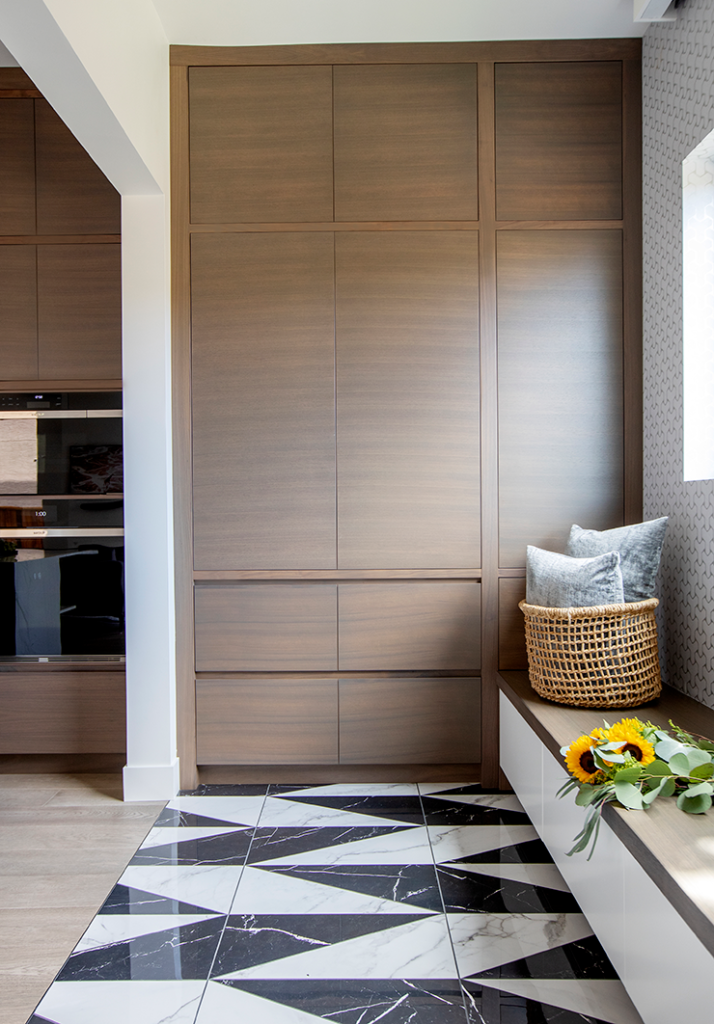
The mudroom, for example, was a small, closed space adjacent to the kitchen, and Jamie’s team extended it right into the pantry, so it could become more usable.
“We opened up the mudroom, which was very closed off, so that they can push a stroller right in. Tall cabinets act as pantries for the overflow from the kitchen, but as the kids grow, they’ll be able to contain backpacks and boots. On the floor, porcelain tile gives the space a durable glam look.”
And without a walled enclosure, the chevroned tiling delineates the space.
It’s a design theme that extends from the front door through to numerous details in the home—unique pops of design on flooring, walls and in tiling.
“On the front door we’ve got a geometric shape that adds depth,” Jamie says. “It’s a motif we tried to pull through the house. It’s fun but it also has a timeless feel.”
In the dining room, Jamie added picture molding to the walls, painting it the same colour as the walls and ceiling. Here, he also inlaid a herringbone pattern into the hardwood floor, encased in a strip of dark brass.
“The idea was to ground the dining room and give it substance,” he says.
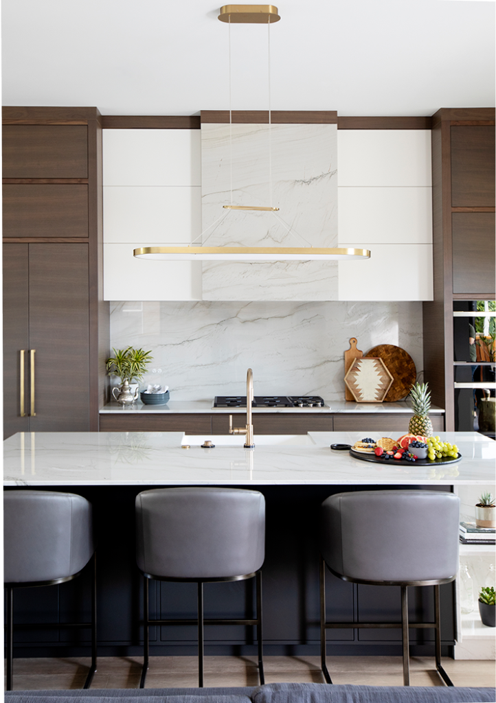
In the kitchen, the couple wanted functionality without giving up style. “So we created lots of tall storage to make use of the 10-foot ceilings, and used commercial-grade wallpaper on the walls, so it’s very durable but adds a unique style to the kitchen space.”
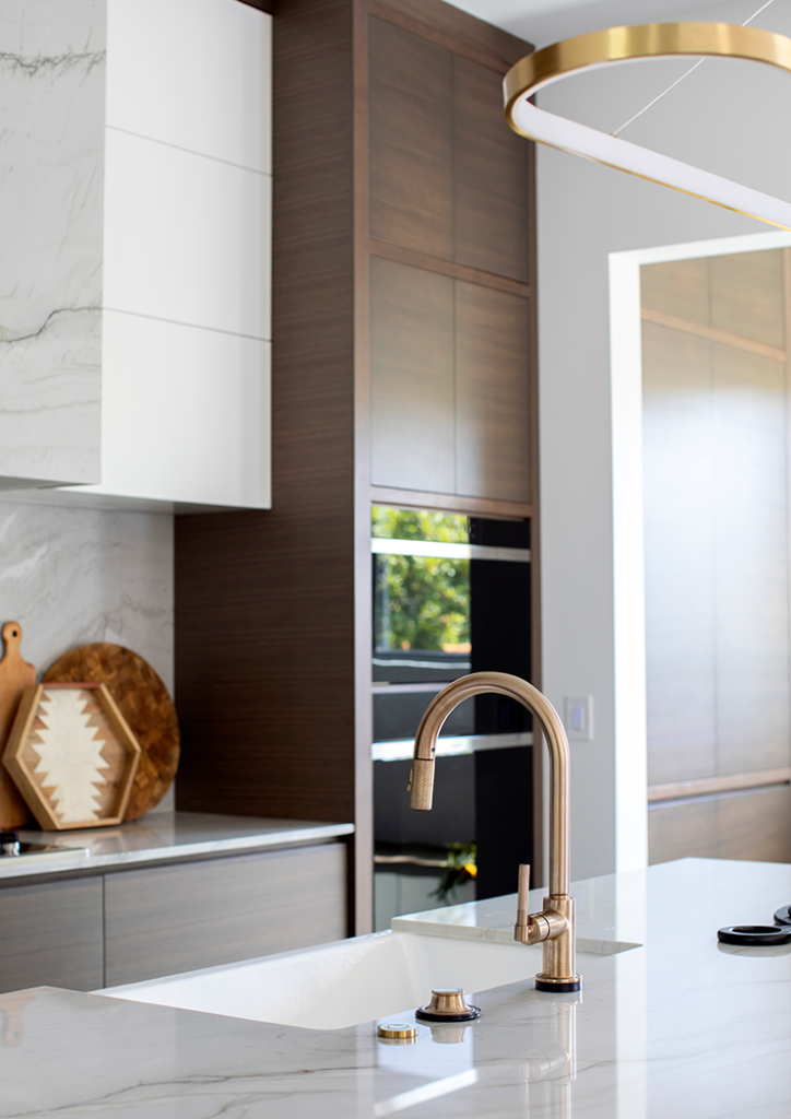
The kitchen island was made to match the motif on the front door, with the addition of a quartzite waterfall and built-in shelving, and the stone backsplash adds a luxurious natural element. Bocci outlets on the backsplash and island were hidden to create a seamless look.
“We kept everything practical and added touches of classic design throughout. The appliances are sleek, the handles and hood vent are hidden away—everything is sophisticated,” Jamie says.
Colour and substance
With “hotel chic” the requested vibe for the main bedroom and bathroom, Jamie worked on creative solutions and simple touches to up the luxury factor and maximize the space.
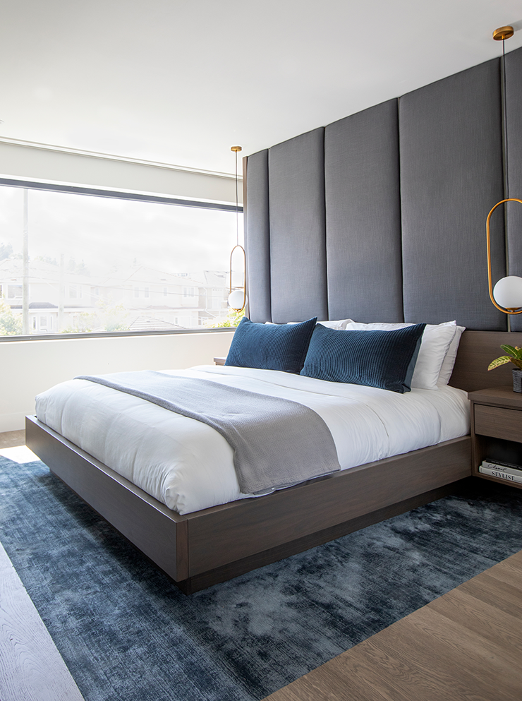
“When we were presenting the bedroom, we were showing the couple the closets,” Jamie says. “The husband was excited, but he wanted the larger closet for himself, so we had to find a way to reposition them. We ended up with a 50-50 split walk-through closet, and removed the wall behind the bed, built a headboard wall with cabinetry, and located the closet behind it.”
Underfoot, Jamie added a carpet inlay beneath the bed.
“Instead of doing an area rug on hardwood, they wanted to step out of bed onto something softer,” he says. “So we laid the floor, but left a section for the bed and laid the carpet in the centre. It gives it a seamless feeling so they don’t have a change in height down from the rug.”
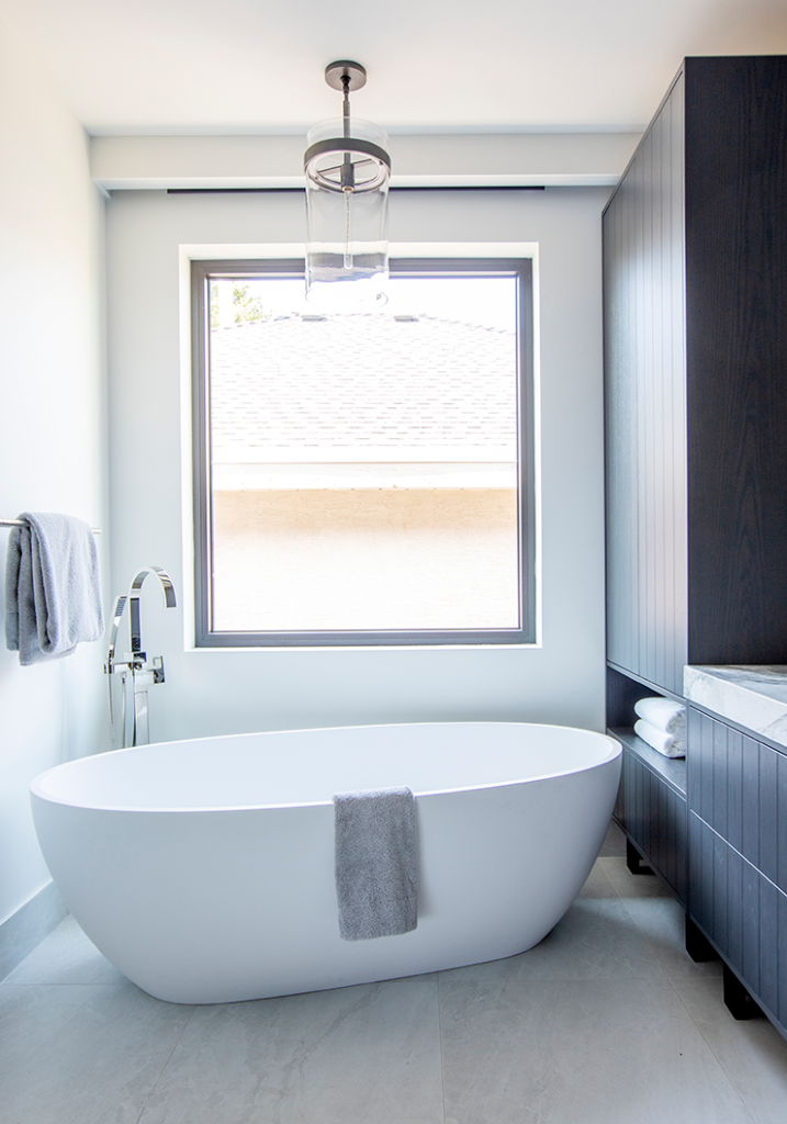
In the main bathroom, Jamie juggled a free-standing tub, shower and vanity in the compact space.
“He was a shower person and she likes tubs, so there was no compromising on either one,” he says. “We found a larger bathtub that they loved and placed it on an angle. We offset the window to centre over the angled tub, and took over some of the hallway closet space to give them a larger walk-in shower.”
A unique colour request presented another interesting challenge.
“The husband’s favourite colour is purple and he asked for a purple bathroom, so we did a deep purple stain on oak for the vanity and a subtle purple stone countertop and tile backsplash.”
The result? Playful sophistication.
“Making it timeless was important because you don’t want to get sick of purple in a couple of years.”
In the main bathroom, which is shared among guests and kids, Jamie opted for a bluer palette, inspired by tile from Ann Sacks.
“It’s vibrant but will also be timeless,” he says.
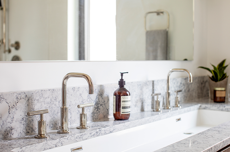
A large mirror uses reflection to enhance the tile’s visual allure, and elegant materials like polished nickel add sophistication. In another unique design decision, Banfield opted for a large sink with two faucets rather than double sinks.
“That way, it’s not awkward in terms of which sink you should use.”
The owners wanted style but also durability here, so Jamie included tall storage with open cubbies to store containers of bath toys, towels, candles and makeup, with flexibility to accommodate their changing needs.
With an eye to the future, Jamie effectively created a vibrant home designed to adapt as the family grows.
“We had very in-depth conversations about how the house would evolve,” he says. “Throughout the entire project, we were thinking ahead, trying to plan how they’ll live in the home for years and years.”

 Full throttle ahead